Welcome to Nekst 3.0

Real estate moves fast. Your software should keep up.
Today we're rolling out Nekst 3.0. It's the biggest update we've ever made the front end user experience, and it's about much more than a fresh coat of paint.
Over the last year we've shipped a long list of new features. Nekst AI, the Client App, AI Contract Reading, Markets, Appointment Tasks. Each one solved a real problem. But each one was bolted onto an interface that wasn't built for them.
Nekst 3.0 is the rebuild. The features you already love now live inside a cleaner, faster, more focused experience. And the new foundation lets us ship the next round of features faster than ever.
Here's what's changed, page by page.
The Tasks Page

This is where most of you spend your day. We rebuilt it around speed.
- Task Flags are now front and center. Mark the tasks that need attention, filter by flag, get to what matters first.
- Inline Comments. See the most recent comment on a task without opening anything. Add a new comment with a single click.
- Updated Filters and Presets. Filters now open as a clean overlay instead of pushing your data around. Saved Filter Presets sit at the top of the page so your favorite views are one click away.
The result: less clicking, less scrolling, more done.
Email Tasks
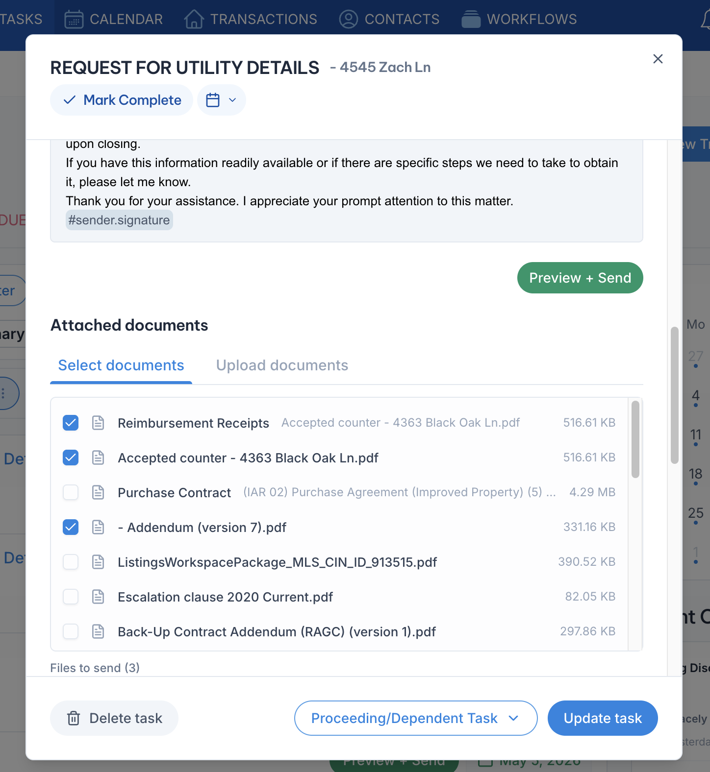
If you send pre-written emails through Nekst, this one is for you.
- Attach an uploaded document to any email with a single click. No more digging, no more drag-and-drop gymnastics. The documents you've already uploaded to a transaction are right there, ready to send.
- Choose Task Completion date. Need to select a different completion date for Dependent Tasks or just to keep an accurate timeline? Click the calendar dropdown above to mark when it was actually done, not when it was checked off.
It's small changes that saves a real amount of time across a busy week.
The Transactions Page
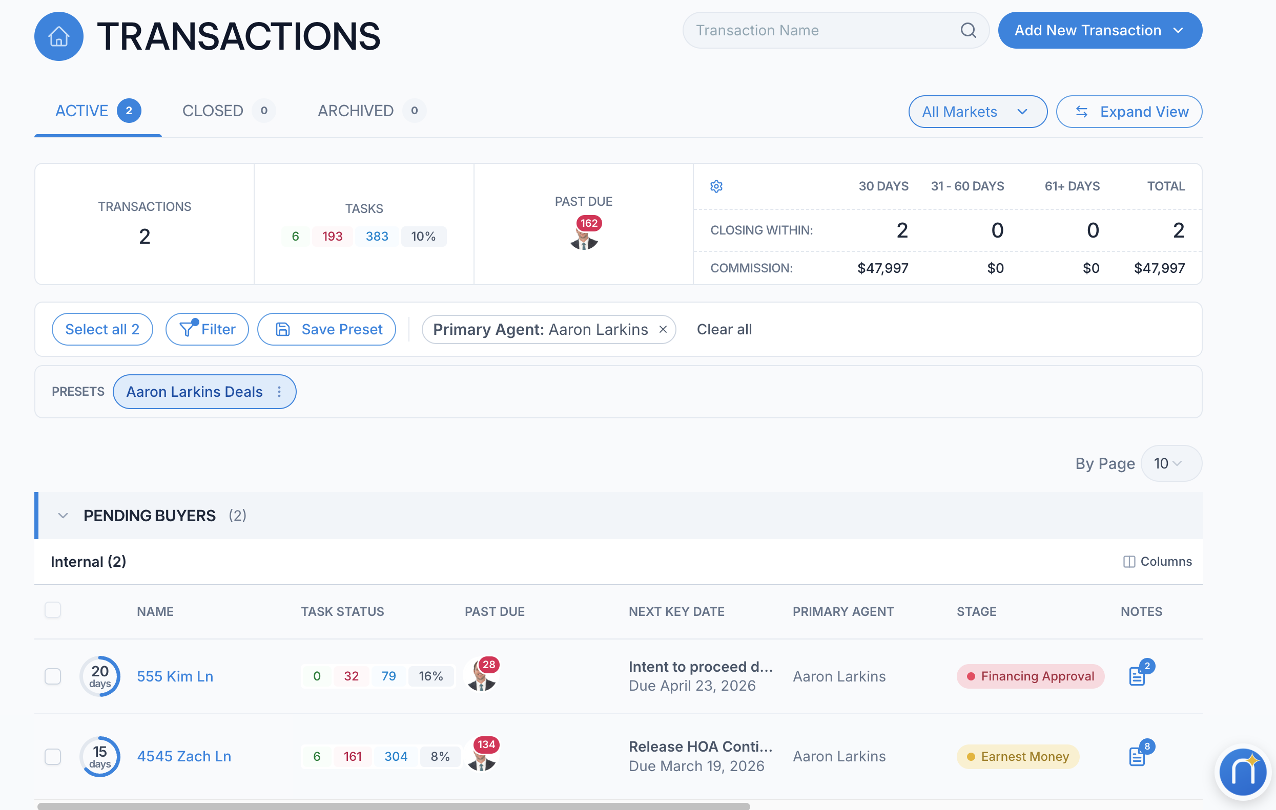
The transactions page got the most love.
- Transaction Stages. Track exactly where each deal sits in your custom pipeline.
- Progress Widgets. See a countdown to your next key date and the percentage of tasks completed for each transaction at a glance.
- Grouping by Market. Stop scrolling through every deal in your portfolio. See your transactions organized by the market they belong to.
- Updated Filters and Presets. Same upgrade as the Tasks page. Faster filtering, presets at the top.
- Transaction Notes, one click away. Read or add a note on any transaction without opening it. Your shorthand for what's going on is always within reach.
A team manager can size up the entire pipeline in one glance. An agent can find the deal they need in seconds.
The Transaction Detail Page

When you do open a specific transaction, the layout is now much easier on the eyes.
- Detail Boxes are grouped by format. Names, dates, dollar amounts, and addresses each cluster together so the page reads like a brief, not a wall of fields.
- Cleaner overall view. Less visual noise, more breathing room, the same information you've always tracked.
You'll find what you need faster. Especially during a stressful contract review.
Transaction Setup

The new Transaction Setup is one of the changes our power users will appreciate most.
- Now opens as a focused modal. Add a new transaction or edit an existing one without leaving the page you're on.
- Easier updates to the basics. Change the transaction name, swap the workflow, adjust start and end dates. All from the same place.
When something changes mid-deal, you fix it in seconds.
The Contacts Page

A small but meaningful upgrade.
- Cleaner Associated Transaction List. When you pull up a contact, the transactions tied to them now display in a way that's easy to scan and easy to act on.
If you manage repeat clients or referral partners, this is a daily quality-of-life win.
3.0 Is Now Standard for Everyone
When 3.0 first launched, we gave everyone a "Try the New Nekst" toggle so you could move at your own pace. That transition is now complete — as of June 2026, Nekst 3.0 is the standard experience for all users, and the old interface has been retired. There’s nothing you need to switch on; you’re already here.
Why This Matters Beyond Today
Here's the part most users won't see but will benefit from for years.
Nekst 3.0 is a new foundation. The way the app is built underneath now lets us ship new features faster, with fewer compromises, and with a more consistent experience every time. It also makes the app easier to learn for new agents and team members joining your operation.
Faster speed. Easier to understand. A platform built for the next decade, not the last one.
Tell Us What You Think
Try the new interface. Use it on a real deal. Then tell us:
- What's better?
- What's worse?
- What's missing?
Send us feedback on our Feature Management page so we can prioritize the next round.
The best version of Nekst is always the one you help shape.